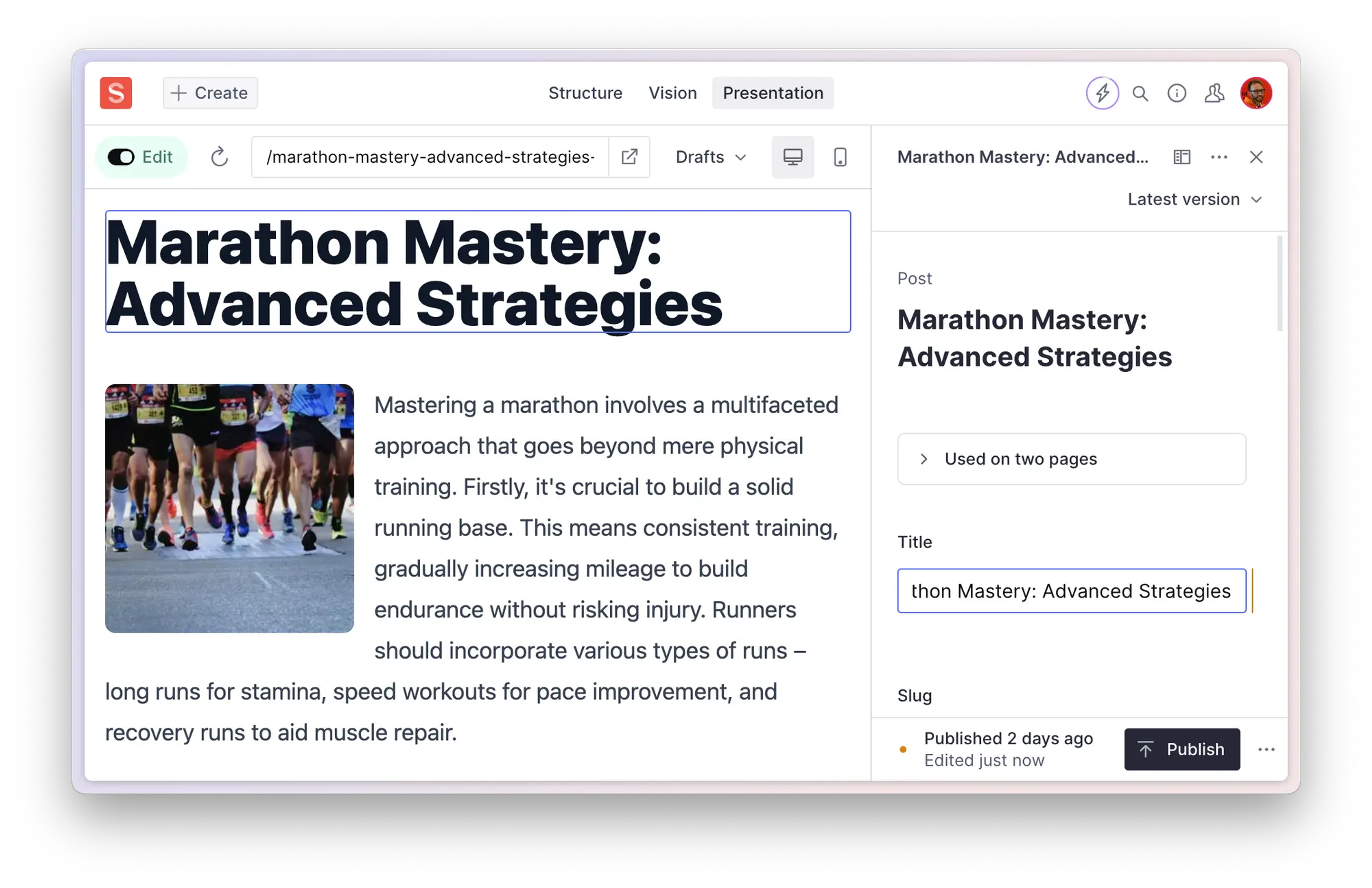
Preview and page building
The Presentation tool in Sanity Studio provides a powerful visual editing experience for content creators.
The Presentation tool in Sanity Studio is a powerful feature that allows editorial teams to work visually with structured content. It provides a bridge between the content model and the front-end presentation, making it easier for content teams to navigate and manage content in context.
Gotcha
The Presentation tool can be customized and configured in considerable detail, so your implementation may not exactly match the examples shown in this article. Talk to your studio maintainer to get the specifics of your setup.
Preview your drafted changes as they'll appear in your front end from within the Sanity Studio editorial interface. See your changes update in the preview area in real-time as you edit your content.
Click any element in the preview to navigate to the corresponding field in your studio editor pane, even deep within a Portable Text block! Since pages in your front end can consist of content from any number of documents, these overlays are invaluable for quickly finding exactly what you're looking for.
Compose entire pages with drag-and-drop-powered page-building features. In addition to simplifying content management, the Presentation tool also supports simple page building using predefined design components, ensuring consistency with brand guidelines and UX best practices.
The presentation tool is in the top studio toolbar, alongside other tools you might have access to, such as the Structure and Scheduling tools.
Once selected, the Presentation tool will show an interactive preview area side by side with the Sanity Studio editorial interface. When no specific route is defined, the preview area will open a default view—like the homepage or an index of available routes—and the editor pane will show a list of all the documents being used by the current preview.
Interacting with the preview area will reveal blue outlined overlays with labels indicating the source documents for elements in the preview. Clicking one of these will cause the document editor pane to navigate to the appropriate document and field, ready for your editing. Your changes will be updated in real-time in the preview!
The preview area has a toolbar of its own, modeled after a typical web browser address bar.
From left to right, this toolbar sports the following elements:
- An Edit toggle button that lets you switch the click-to-edit overlays in the preview area on or off. This is useful for navigating the preview without accidentally switching the form editor to a different context.
- An address field where you may manually enter the route you want to preview, refresh the preview area, and open the current front-end route in a new tab.
- A button to switch the preview area between desktop and mobile viewport sizes lets you quickly check that your drafted edits will work on all devices.
- A share button that lets you share a preview of your draft by copying a link or QR code.
We'll discuss each of these in more detail in the upcoming sections.
There are several different ways to open a specific front-end route in the Presentation tool. The most straightforward is to type or paste the path of the page you want to preview into the tool's address field.
Gotcha
Make sure you only copy and paste the relative path! This is typically the stuff that appears after the root domain. In the example below, the relevant part is within the square brackets.https://my-cool-site.com[/posts/hello-world]
Another option for a more "studio first" approach is to navigate to the relevant document in the Structure tool. You should see a list of pages where the document content appears below the document title. Clicking one of these will open the corresponding route in the preview area.
Gotcha
If you can't see the list of routes, your studio maintainer may have to set up a location resolver first.
When the Edit toggle is active, you can hover any element in the preview area to see a blue outline with a label indicating the source document in Sanity Studio. Clicking the overlay will cause the form editor to navigate to the relevant document and field. Since any page on your front end can include content from multiple documents, it is very useful for quickly navigating to the appropriate document in your studio.
Once you've found the field you want to edit, the preview will update in real time to reflect your changes.
The overlays will let you navigate to specific bits of content, no matter how deep in your content structure. For example, you can target specific blocks within a Portable Text Field. In the example below, clicking an image within a block of rich content in the preview area opens the details dialog for the relevant image within the Portable Text editor.
Protip
Make sure your images have alt text! Not only is it important for accessibility, but it also helps the Presentation tool find your images.
The Presentation tool can also be set up to accommodate page-building, with a drag-and-drop interface to rearrange content blocks. Drag-and-drop can be enabled for array fields and configured to allow for either vertical or horizontal positioning.
When you hover any draggable element, your cursor will turn into a crosshair, indicating that the element can be moved around by clicking and dragging. When you do so, a simplified representation of the block you are repositioning appears.
In certain cases, like in the example above, it might be useful to zoom out a bit to see the full context of the repositionable area. Hold down shift while dragging to enter a helpful minimap mode.
Draggable blocks also have a context menu, accessible by right-clicking, that offers several helpful options for repositioning, removing, or adding content.
Let's examine in more detail the opportunities offered by the address bar in the Presentation tool's preview area.
You can temporarily disable overlays so you can click links and navigate your front end within the preview area. Do so by toggling the Edit switch in the preview address bar.
To quickly toggle between previewing your drafted changes or your published content, locate the Perspective select dropdown to the right of the address field.
To resize the viewport, click the Phone icon second from the right in the preview address bar.
Your preview area will resize to a more mobile format, so you can make sure your content looks good on the go.
To quickly share a preview link, click the Share icon on the far right in the preview area address bar.
A popover will appear with options to enable or disable sharing. A QR-code is generated for easy access from any device with a camera, or you can opt to copy a link in plain text if you so prefer.