Introduction to the Presence API
Learn how the Presence API works and how to integrate it with your own custom input components
Gotcha
The Presence API is only available in Sanity Studio v1/v2. If you're migrating to v3, review the Migrating Custom Input Components guide.
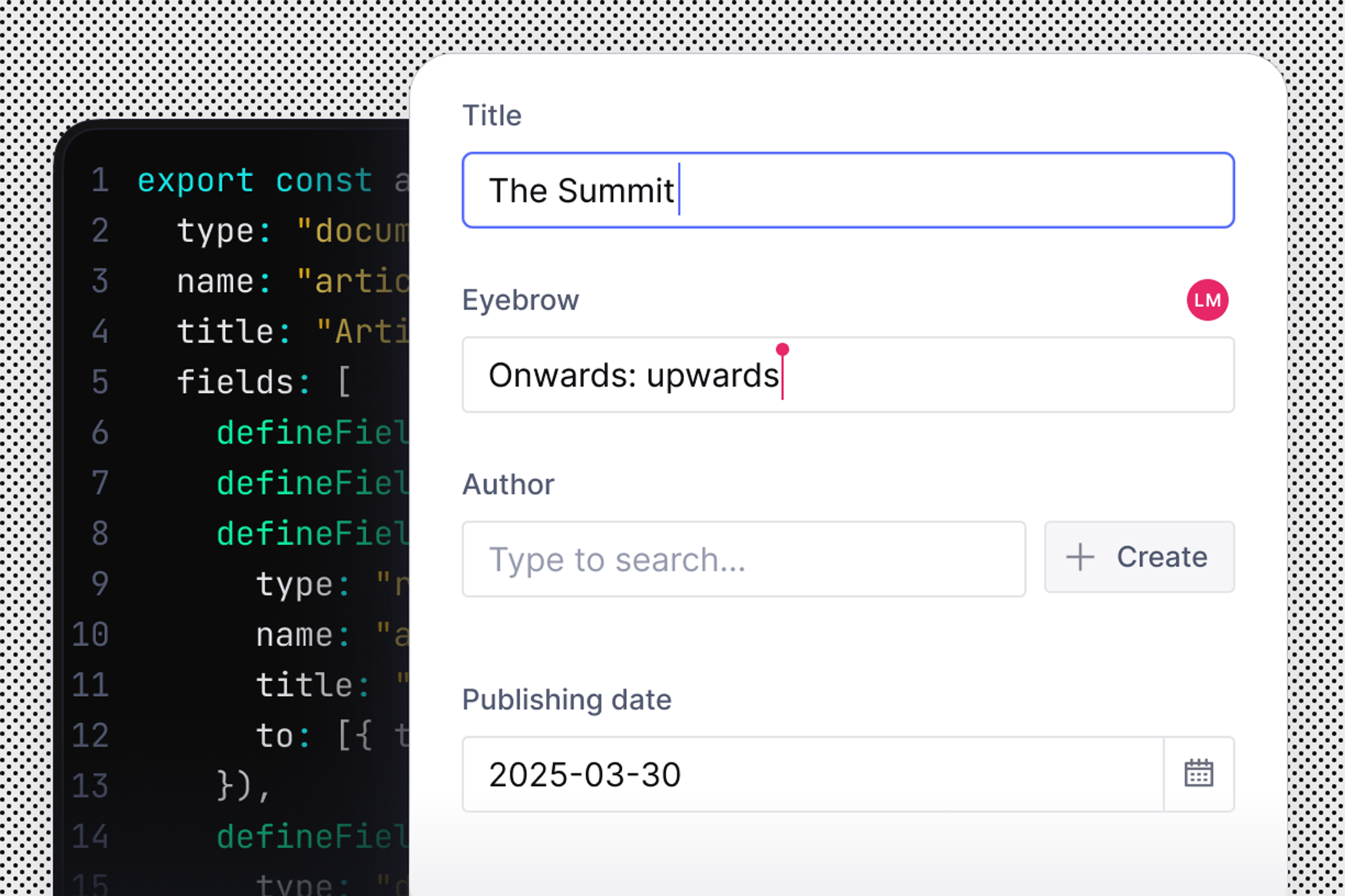
When you have more than one person working in your Studio at the same time, it becomes important to see where everyone is working. Presence allows you to see who is in specific documents and fields in the Studio.
Presence takes the form of editor avatars that travel around Studio. All the editors currently in a Studio will appear in the navigation. When you click on the avatars, you can select a user and jump directly to the document they are editing.
While inside a document, you can see which editors are editing which fields.
When you log in, Sanity Studio opens a Web Socket connection to the hosted datastore. Each user's state is updated via this Socket, as well as returning the global state of all users as that changes.
This state is then used to communicate with Studio's base inputs using a combination of 3 publicly available helper components. These components allow developers to use Presence in their custom inputs and plugins.
Presence is a default feature built into the Studio. If your Studio is version 1.150.0 or greater, you have access to Presence. All default Studio inputs or custom inputs that use the FormField
component will already be set to use Presence with no additional code.
import FormField from 'part:@sanity/components/formfields/default'
function MyCustomInput(props) {
const {type, value} = props
return (
<FormField label={type.title} description={type.description}>
// .... your custom input implementation
</FormField>
)
}
For inputs not using FormField, the built-in Presence experience can still be added. To add the base component, use the FieldPresence
component from @sanity/base/presence
.
import {FieldPresence} from '@sanity/base/presence'
function MyCustomInput(props) {
const {type, value} = props
return (
<div>
<FieldPresence />
<input type="text" value={value} /*...*/ />
</div>
)
}
For custom inputs that are arrays or objects, a custom scope needs to wrap FieldPresence
component. The PresenceScope
component accepts a path
object. The path
object contains an array of identifiers for fields the Presence information is scoped to.
import {FieldPresence} from '@sanity/base/presence'
function MyCustomObject(props) {
const {value, type, onFocus} = props
return (
<div tabIndex={0} onFocus={onFocus}>
<h3>{type.title}</h3>
<p>{type.description}</p>
<ul>
{type.fields.map(field => (
<li key={field.name}>
<PresenceScope path={[field.name]}>
<FieldPresence />
</PresenceScope>
<input type="string"
key={field.name}
value={value && value[field.name]}
onFocus={() => onFocus([field.name])}
//...
/>
</li>
))}
</ul>
</div>
)
}
Arrays use the same PresenceScope
to provide context for each item in the array.
A custom input that exists inside a dialog does not get a sticky Presence indicator by default. To support this, the dialog needs to use the PresenceOverlay
helper component.
import {Presence, PresenceOverlay} from '@sanity/base/presence'
import {FormBuilderInput} from 'part:@sanity/form-builder'
// ... some parts omitted for brevity
// ... additional functionality
export function CustomInputWithDialogOverlay(props) {
const {value, type, focusPath, onFocus, level, onChange, onBlur} = props
const [isOpen, setIsOpen] = React.useState(false)
return (
<>
{isOpen && (
<Dialog onClose={() => setIsOpen(false)}>
<PresenceOverlay>
<div style={{padding: 10}}>
{type.fields.map((field, i) => (
// Delegate to the generic FormBuilderInput. It will resolve and insert the actual input component
// for the given field type
<FormBuilderInput
level={level + 1}
key={field.name}
type={field.type}
value={value && value[field.name]}
onChange={patchEvent => handleFieldChange(field, patchEvent)}
path={[field.name]}
focusPath={focusPath}
onFocus={onFocus}
onBlur={onBlur}
/>
))}
</div>
</PresenceOverlay>
</Dialog>
)}
<div>
<div>{type.title}</div>
<em>{type.description}</em>
<div>
<Button onClick={() => setIsOpen(true)}>Click to edit</Button>
{!isOpen && <FieldPresence />} {/* Show field presence here! */}
</div>
</div>
</>
)
}
If you don't want to show any Presence indicator in your custom input component you can leave your input as is. If your custom input is using the FormField
component, however, you need to pass an additional presence
prop. This prop needs a value of an empty array to opt the input out of Presence.
import FormField from 'part:@sanity/components/formfields/default'
function MyCustomInput(props) {
const {type, value, presence} = props
return (
<FormField
presence={[]}
label={type.title}
description={type.description}>
//...
</FormField>
)
}