Roboto Studio
The best editorial experiences on the web
We assisted Topaz Labs, the industry-leading AI enhancement suite, in creating a documentation system powered by Sanity, Next, Mux, and Chakra UI.

We started with a plan
We were contacted by Eric, the CEO of Topaz lab to help create a solution to condensing all of their documentation into a singular platform that was both extensible and highly customisable.
Naturally our first steps were to use Sanity CMS, Next.js, and Vercel, we embarked on an exciting journey that transformed expectations of what a documentation system can include.
We ensured every aspect had been thought about, from the presentation of placeholders and field descriptions to the instantaneous feedback of a live preview system. We didn't want to build just "a documentation system". We ventured to build "the best documentation system."
Add some Sanity
The first piece of our digital jigsaw was Sanity CMS. We took advantage of its real-time capabilities to build a dynamic content management system that would have put Gutenberg's movable type to shame. But we didn't stop there. With the malleability of the platform, we developed custom input components and tailored the CMS to fit Topaz's needs.
A little style
Then came Chakra UI. Like an expert stylist, we used it to dress up our system in a way that was not only visually appealing but also met all the best practices for accessibility and responsiveness. It was our digital color palette, with the flexibility of themes and components to create a harmonious, unified appearance across all documentation.
We collaborated with the internal design team at Topaz Labs, which expanded the infrastructure of Chakra UI. They implemented the nuanced colour scheme with lavish purples and extra slick gradient borders. We couldn't have done it without them, and they really did an incredible job of adding that extra bit of jazz to the overall design.
What is a Mux anyway?
Finally, Mux added the cherry on top. This cutting-edge tool brought our documentation to life with high-quality, seamlessly streaming videos. It was like handing our users their personal IMAX experience, delivering video content tailored to their device and connection speed.
If you don't know what Mux is, I'll give you the lowdown. Videos are about the heaviest piece of data on a website and a nightmare to store and stream at that. Mux takes away all this stress and compresses the video to the appropriate size. E.g. Mobile phone - small, Desktop - large.
The best editorial experiences on the web
Founder @ Roboto Studio - The Sanity & Next.js experts
Sr. Full Stack Developer at Roboto Studio
Old faithful, but built in the app router. Testing out the latest and greatest features on our own website, now, with added purple.
Go to Roboto StudioBuilding a lightning-fast credit card comparison platform in 6 weeks flat with Next.js and Sanity
Go to Money AtlasWe consulted Savory & Partners: boosting Lighthouse scores from 60 to 90+, migrating to Tailwind & optimising the hell out of GROQ
Go to Savory & PartnersBuilding incredible editorial experiences for the independent Shopify specialists
Go to GraftstudioContent operations
Content backend


The only platform powering content operations
By Industry


Tecovas strengthens their customer connections
Build and Share

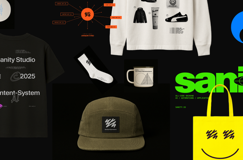
Grab your gear: The official Sanity swag store
Read Grab your gear: The official Sanity swag store