Roboto Studio
The best editorial experiences on the web
Serving the finest Sanity experience for an Italian Deli

We wanted to build an ultra-fast, ultra efficient website for one of the best Pasta & Sandwich deli's in Nottingham. We've worked with Met (the founder) for a long time helping them grow their web-presence, and optimise their website.
For Solo Grano, the optimal usage of the website is a quick reference point for the in-house menu, or the two links to Deliveroo and Uber. However behind the scenes we create a rich funnel building system to allow them to quickly spin-up several landing pages with extreme efficiency.
Key features
The best editorial experiences on the web
Old faithful, but built in the app router. Testing out the latest and greatest features on our own website, now, with added purple.
Go to Roboto StudioBuilding a lightning-fast credit card comparison platform in 6 weeks flat with Next.js and Sanity
Go to Money AtlasWe consulted Savory & Partners: boosting Lighthouse scores from 60 to 90+, migrating to Tailwind & optimising the hell out of GROQ
Go to Savory & PartnersBuilding incredible editorial experiences for the independent Shopify specialists
Go to GraftstudioContent operations
Content backend


The only platform powering content operations
By Industry


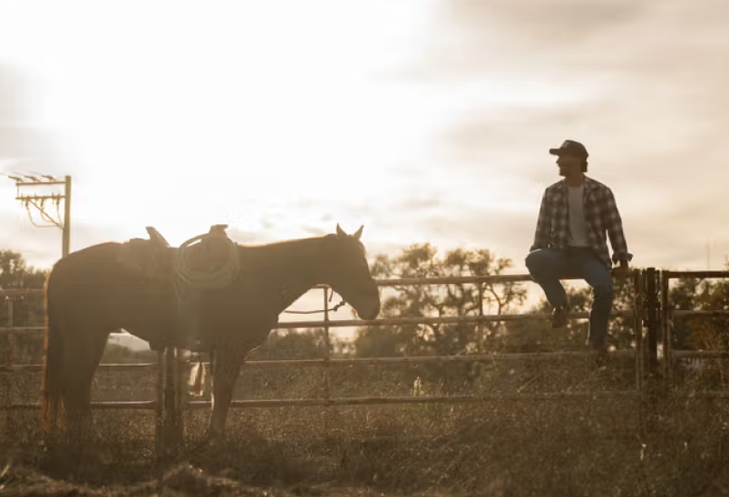
Tecovas strengthens their customer connections
Build and Share

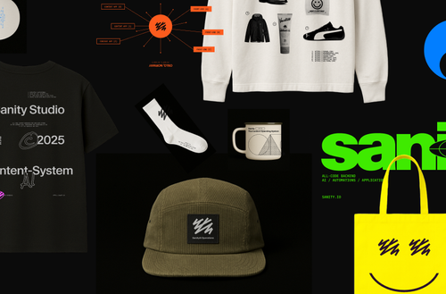
Grab your gear: The official Sanity swag store
Read Grab your gear: The official Sanity swag store