Level up Your Edit Modal with Next/Previous Navigation Buttons for Array Items
Streamline your array edit workflow by enabling smooth navigation through array items within the default edit modal. This guide walks you through building a clean, user-friendly solution for your Sanity Studio.
This developer guide was contributed by Saskia Bobinska (Senior Support Engineer).
When working with arrays in Sanity Studios, editing individual items can get tedious — especially when you have to open and close the modal for each one.
What if you could streamline that process with simple next and previous buttons right inside the modal?
In this guide, you'll learn how to enhance the default edit modal with navigation controls that let you move smoothly between array items — without ever closing the modal. It's a small UX improvement that makes a big difference in editor efficiency and workflow satisfaction.
Let’s dive in! 🚀
Before digging into the code, it is useful to understand how array item components work.
Every item has its (object) input passed down to its props as children (JSX Elements) which means we can access them in a custom item component and add our buttons to the object input component rendered in the modal.
You can find the finished code in the last chapter.
Create a custom component for the array items
Let's start then!
Create a file called ArrayItemWithNavigator.tsx in your studio components folder.
In that file, add this bare-bone item component:
import { ComponentType } from 'react'
import {
  ItemProps,
} from 'sanity'

const ArrayItemWithNavigator: ComponentType<ItemProps> = (props) => {

  return props.renderDefault({
    ...props,
    // this is how we can extend the props which get rendered out in the item
  })
}

export default ArrayItemWithNavigator
As you can see, we can extend the props passed down to renderDefault in order to change individual props.
Next, we’ll retrieve the array value so we can access all its items and their corresponding paths. These will be used later to navigate between items within the modal.
import { ComponentType } from 'react'
import {
  ItemProps,
} from 'sanity'

const ArrayItemWithNavigator: ComponentType<ItemProps> = (props) => {
    // * Get the array value from the form
  const arrayValue = useFormValue(['arrayNavigator']) as Array<
    ObjectItem & { title: string }
  >
  // * Get the path to the array (parent) for later focusing
  const arrayPath = props.path.slice(0, -1)

  /** Find the previous and next item in the array
   *
   * Returns the previous and next item in the array
   */
  const findPreviousAndNextArrayItems = () => {
    // * Get the current item key
    const currentItemKey = (props.value as ObjectItem)?._key

    const currentIndex = arrayValue.findIndex(
      (item) => item._key === currentItemKey,
    )
    // return both the previous and next item in the array, and if currentIndex is the first item, previous will be the last item and visa versa.
    return {
      previous:
        currentIndex === 0
          ? arrayValue[arrayValue.length - 1]
          : arrayValue[currentIndex - 1],
      next:
        currentIndex === arrayValue.length - 1
          ? arrayValue[0]
          : arrayValue[currentIndex + 1],
    }
  }

  return props.renderDefault({
    ...props,
    // this is how we can extend the props which get rendered out in the item
  })
}

export default ArrayItemWithNavigator
Create a custom Children component
Alright, with that out of the way, let’s add a Children component to ArrayItemWithNavigator.tsx. Since it’s only used internally, we can place it right above the ArrayItemWithNavigator.
const Children = ({
  children,
  navigation,
  arrayPath,
}: {
  children: ObjectItemProps['children']
  navigation: {
    previous: ObjectItem & { title: string }
    next: ObjectItem & { title: string }
  }
  arrayPath: Path
}) => {

  return(
    <Stack>
      <Flex justify="flex-end" gap={4} id="navigatorButtons">
        {/* our buttons will go here */}
      </Flex>
      {children}
    </Stack>
  )
}
We need to define a navigation handler for the buttons next, which will take the path to the array and return a path for the items before and after the current one.
Because we need something to open those paths, we can make use of onPathOpen and onFocus which we can get from the useDocumentPane hook (please read the Gotcha below carefully).
//* We use this INTERNAL hook to focus the next or previous item in the array
  // Since it is internal changes can be made to it without notice -> ADD CLEAR DEBUGGING INSTRUCTIONS FOR YOURSELF HERE!
  const { onFocus, onPathOpen } = useDocumentPane()

  /** will open any item in the parentArray and loop over it */
  const handleNavigation = (key: string) => {
    onPathOpen(arrayPath.concat({ _key: key }, 'title'))
    onFocus(arrayPath.concat({ _key: key }, 'title'))
  }
The useDocumentPane hook is marked as internal and should only be used sparingly. Internal APIs can change without notice, and you will be responsible for maintaining and debugging your code that uses the hook.
Make sure to add error handlers and debug instructions anywhere you use it.
Defining the buttons
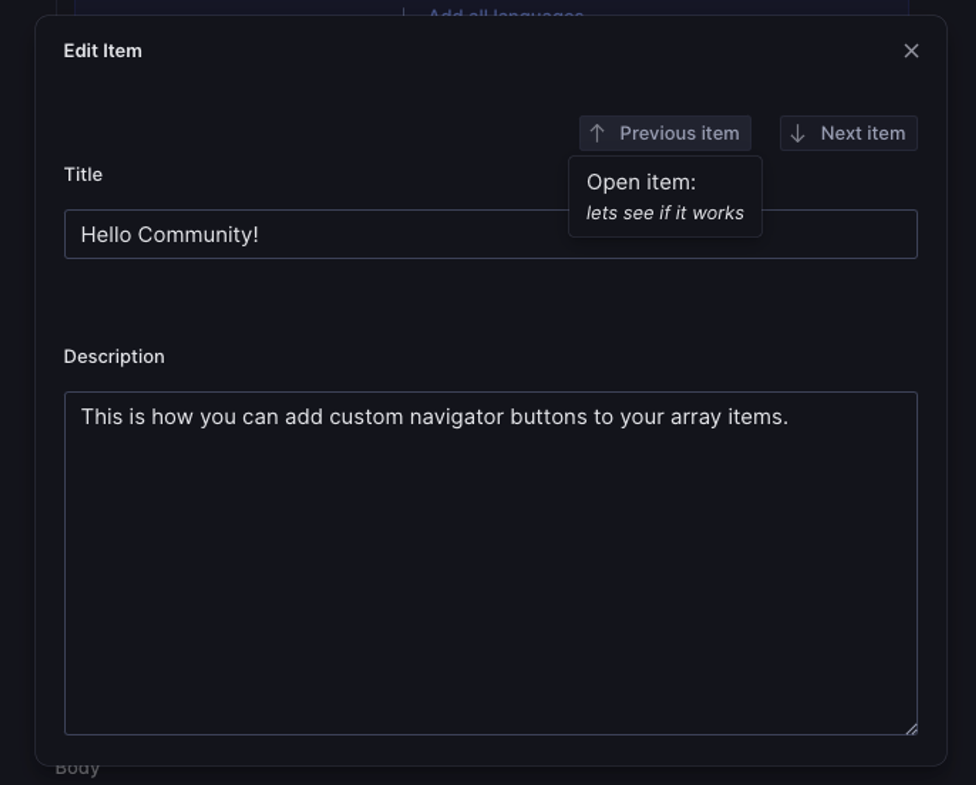
With that in place, we need to add our buttons to the Flex component. We will also add tooltips to the buttons because we want our editors to have more insights into where they are navigating. In those tooltips, we will display the title of the previous/next item.
const Children = ({
  children,
  navigation,
  arrayPath,
}: {
  children: ObjectItemProps['children']
  navigation: {
    previous: ObjectItem & { title: string }
    next: ObjectItem & { title: string }
  }
  arrayPath: Path
}) => {

  return(
    <Stack>
      <Flex justify="flex-end" gap={4} id="navigatorButtons">
        {/* PREVIOUS BUTTON */}
        <Tooltip
          portal
          padding={3}
          content={
            <Box>
              <Stack space={3}>
                <Box>
                  <Text>Open item: </Text>
                </Box>
                <Box>
                  <Text size={1} style={{ fontStyle: 'italic' }}>
                    {navigation.previous.title}
                  </Text>
                </Box>
              </Stack>
            </Box>
          }
        >
          <Button
            id="previous-array-item-button"
            text={'Previous item'}
            icon={ArrowUpIcon}
            onClick={() => handleNavigation(navigation.previous?._key)}
            mode="ghost"
            size={1}
            padding={2}
          />
        </Tooltip>
        {/* NEXT BUTTON */}
        <Tooltip
          portal
          padding={3}
          content={
            <Box>
              <Stack space={3}>
                <Box>
                  <Text size={1}>Open item: </Text>
                </Box>
                <Box>
                  <Text size={1} style={{ fontStyle: 'italic' }}>
                    {navigation.next.title}
                  </Text>
                </Box>
              </Stack>
            </Box>
          }
        >
          <Button
            id="next-array-item-button"
            text={'Next item'}
            icon={ArrowDownIcon}
            onClick={() => handleNavigation(navigation.next?._key)}
            mode="ghost"
            size={1}
            padding={2}
          />
        </Tooltip>
      </Flex>
      {children}
    </Stack>
  )
}
Extend props.children with the custom Children component
Now that we have the custom Children component we can use it to extend children in the props we pass down to renderDefault in the array item component:
return props.renderDefault({
    ...props,
    //* Because children holds the object input component for the modal, we can extend what is going to be rendered in the modal.
    children: (
      <Children
        children={props.children}
        navigation={findPreviousAndNextArrayItems()}
        arrayPath={arrayPath}
      />
    ),
  })
Add the ArrayItemWithNavigator item component to array members
We're almost finished! The only remaining step is to add an custom item component to the array members in your field schema:
defineField({
  name: 'arrayNavigator',
  title: 'Array with navigator',
  type: 'array',
  of: [
    defineArrayMember({
      type: 'object',
      name: 'item',
      components: { item: ArrayItemWithNavigator },
      fields: [
        defineField({
          name: 'title',
          type: 'string',
          title: 'Title',
          validation: (Rule) => Rule.required(),
        }),
        defineField({
          name: 'description',
          type: 'text',
          title: 'Description',
        }),
      ],
    }),
  ],
})
Finished code
And we're done 🥳 you will now be able to navigate between item edit modals, without closing them.
// ArrayItemWithNavigator.tsx

import { ArrowDownIcon, ArrowUpIcon } from '@sanity/icons'
import { Box, Button, Flex, Stack, Text, Tooltip } from '@sanity/ui'
import { ComponentType } from 'react'
import {
  defineArrayMember,
  defineField,
  ItemProps,
  ObjectItem,
  ObjectItemProps,
  Path,
  useFormValue,
} from 'sanity'
import { useDocumentPane } from 'sanity/structure'

const Children = ({
  children,
  navigation,
  arrayPath,
}: {
  children: ObjectItemProps['children']
  navigation: {
    previous: ObjectItem & { title: string }
    next: ObjectItem & { title: string }
  }
  arrayPath: Path
}) => {
  //* We use this INTERNAL hook to focus the next or previous item in the array
  // Since it is internal changes can be made to it without notice -> ADD CLEAR DEBUGGING INSTRUCTIONS FOR YOURSELF HERE!
  const { onFocus, onPathOpen } = useDocumentPane()

  /** will open any item in the parentArray and loop over it */
  const handleNavigation = (key: string) => {
    onPathOpen(arrayPath.concat({ _key: key }, 'title'))
    onFocus(arrayPath.concat({ _key: key }, 'title'))
  }

  return (
    <Stack>
      <Flex justify="flex-end" gap={4} id="navigatorButtons">
        <Tooltip
          portal
          padding={3}
          content={
            <Box>
              <Stack space={3}>
                <Box>
                  <Text>Open item: </Text>
                </Box>
                <Box>
                  <Text>{navigation.previous.title}</Text>
                </Box>
              </Stack>
            </Box>
          }
        >
          <Button
            id="previous-array-item-button"
            text={'Previous item'}
            icon={ArrowUpIcon}
            onClick={() => handleNavigation(navigation.previous?._key)}
            mode="ghost"
            size={1}
            padding={2}
          />
        </Tooltip>
        <Tooltip
          portal
          padding={3}
          content={
            <Box>
              <Stack space={3}>
                <Box>
                  <Text size={1}>Open item: </Text>
                </Box>
                <Box>
                  <Text size={1} style={{ fontStyle: 'italic' }}>
                    {navigation.next.title}
                  </Text>
                </Box>
              </Stack>
            </Box>
          }
        >
          <Button
            id="next-array-item-button"
            text={'Next item'}
            icon={ArrowDownIcon}
            onClick={() => handleNavigation(navigation.next?._key)}
            mode="ghost"
            size={1}
            padding={2}
          />
        </Tooltip>
      </Flex>
      {children}
    </Stack>
  )
}
const ArrayItemWithNavigator: ComponentType<ItemProps> = (props) => {
  // * Get the array value from the form
  const arrayValue = useFormValue(['arrayNavigator']) as Array<
    ObjectItem & { title: string }
  >
  // * Get the path to the array (parent) for later focusing
  const arrayPath = props.path.slice(0, -1)

  /** Find the previous and next item in the array
   *
   * Returns the previous and next item in the array
   */
  const findPreviousAndNextArrayItems = () => {
    // * Get the current item key
    const currentItemKey = (props.value as ObjectItem)?._key

    const currentIndex = arrayValue.findIndex(
      (item) => item._key === currentItemKey,
    )
    // return both the previous and next item in the array, and if currentIndex is the first item, previous will be the last item and visa versa.
    return {
      previous:
        currentIndex === 0
          ? arrayValue[arrayValue.length - 1]
          : arrayValue[currentIndex - 1],
      next:
        currentIndex === arrayValue.length - 1
          ? arrayValue[0]
          : arrayValue[currentIndex + 1],
    }
  }

  return props.renderDefault({
    ...props,
    //* Because children holds the object input component for the modal, we can extend what is going to be rendered in the modal.
    children: (
      <Children
        children={props.children}
        navigation={findPreviousAndNextArrayItems()}
        arrayPath={arrayPath}
      />
    ),
  })
}

// schema field definition
defineField({
  name: 'arrayNavigator',
  title: 'Array with navigator',
  type: 'array',
  of: [
    defineArrayMember({
      type: 'object',
      name: 'item',
      components: { item: ArrayItemWithNavigator },
      fields: [
        defineField({
          name: 'title',
          type: 'string',
          title: 'Title',
          validation: (Rule) => Rule.required(),
        }),
        defineField({
          name: 'description',
          type: 'text',
          title: 'Description',
        }),
      ],
    }),
  ],
})