E-commerce SEO: The Essential Guide To Success
Almost every product page on the internet looks the same: from a 50-cent hex bolt to a thousand-dollar fire pit. Stand out from the crowd and improve your e-commerce product pages using these 5 tips.

Simen Svale
Co-founder and CTO at Sanity
Published:

Shopping used to be a colorful and personal experience. Back in the golden age of mail-order items, people browsed through magazines with gorgeous full-page spreads that showed off all the latest gadgets.
While I love shopping, I don’t love that we’ve lost this creative touch. We now have the technology to make shopping more intimate and exciting than ever before. So why do online stores look so generic? Why are product pages so boring?
Merchants say they have grand visions for their digital shopping experiences, but they can’t afford to spend money on armies of content creators and designers. I have some good news: they don’t need to.
By treating content as structured data and using a little coding magic, teams can stretch their content across multiple pages and create standout shopping experiences. Here are five tips that will help you create product pages using structured content.
Many content creation teams rely on templates to quickly spin up new content. Templates do provide much-needed agility, but it’s often at the expense of originality. To show off your unique products, create layouts that dynamically respond to different types of content.
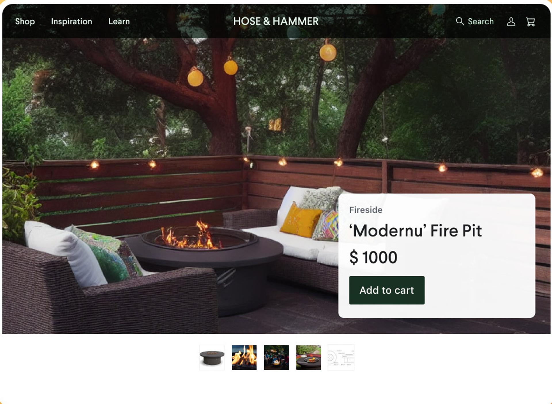
Let’s say you operate an online store. Among other things, you sell hex bolts and fire pits. These two products could not be more different. A hex bolt costs around fifty cents. People usually know when they need one; they don’t shop around for bolts until they find the perfect fit. A fire pit can run you thousands of dollars, and shopping for the perfect one is a time-consuming and personal experience. Given these clear differences, a product page for a hex bolt should not at all resemble a product page for a fire pit—and yet, they often do.

To differentiate the two types of content, you don’t need armies of designers. Rather, structured content enables you to categorize your products based on the type of experience a shopper might want when making a purchase and adapt your page layout accordingly.
A product page for tools like nuts, bolts, hammers, and nails probably just require a few photos of the item. However, items that are categorized as lifestyle products—like a fire pit—benefit from a page layout that inspires people to click through. Gallery photos laid out across easily navigable pages show off the product, inviting consumers to picture themselves enjoying their new item.
Treating content as data takes the manual work out of the content creation process. The data guides the decision-making.
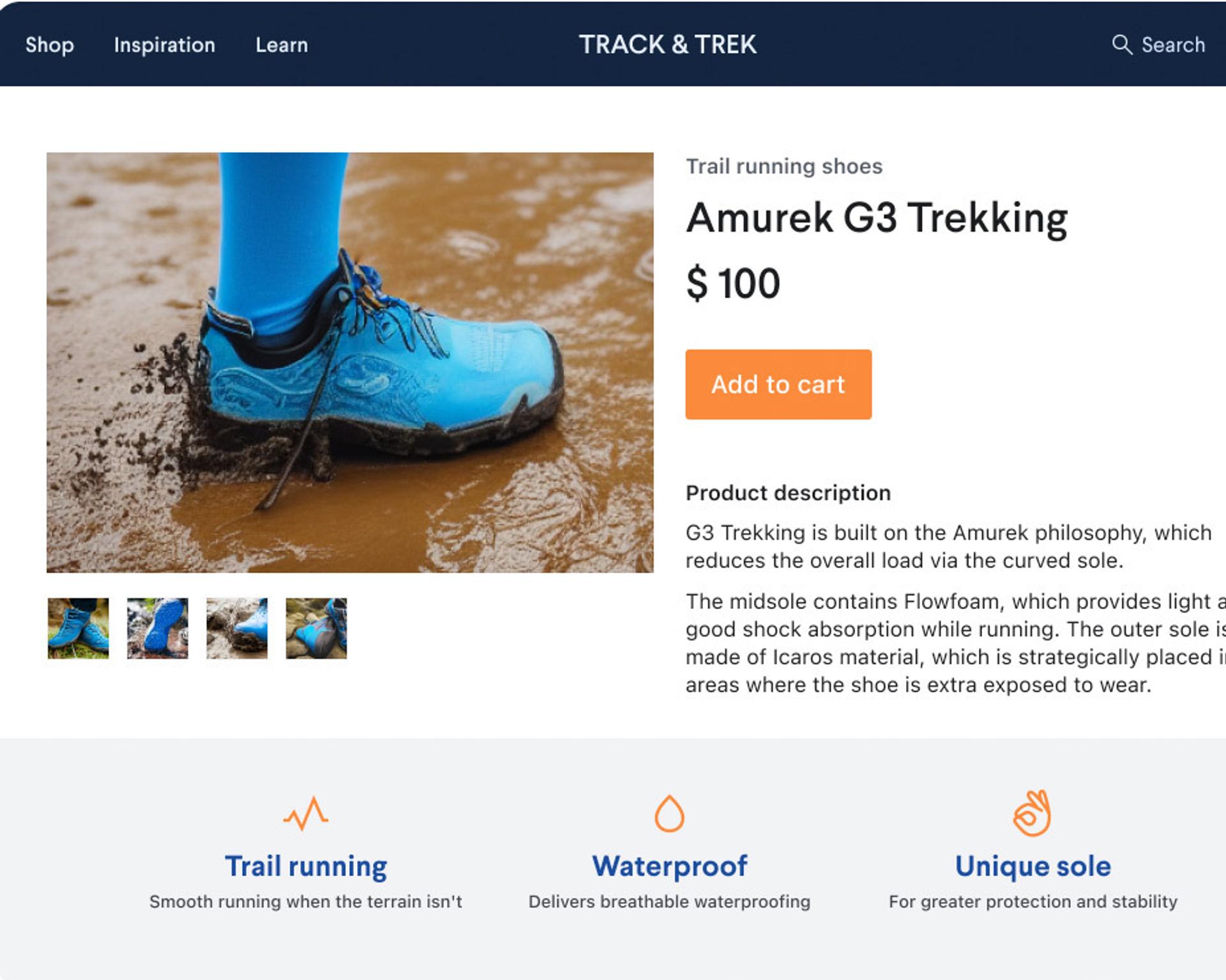
A lot of product pages include specifications to help shoppers choose the right fit. Think about a product page for a laptop, which might include the dimensions, weight, speed, storage capacity, and so on.
In many cases, though, product pages aren’t thoughtful with the specs they include. Instead, they simply lay out every stat in the book. The shopper is left sifting through dense lists of numbers to try and find the relevant information. Upon entering an electronics store, the customer probably doesn’t want to hear about the dimensions of the trackpad immediately; they want to know how fast and light the machine is. The same principle applies digitally.

Rather than making your shopper work for what they need, automatically highlight the most important specs at the top of the page. A structured content approach allows you to map types of data to specific page layouts. For example, a product page for a laptop—or for any content categorized as an electronic device—would highlight things people care about, like memory and speed.
Shoppers don’t always end up on the right page. But the wrong page shouldn’t be a dead end. And when someone clicks on an item that isn’t what they’re looking for, they shouldn’t have to spend too much time hunting for what they want. If they get frustrated, the shopper will end up turning to a competitor.
In a physical store, a clerk would notice a lost shopper and swing by to help them out—and that’s exactly what a good product page should do. Keep the shopper on your site by designing every page to guide them toward the thing they want.
A simple solution is to create an explorer that breaks out product categories on the page, so the shopper can search for an item based on what matters most to them. On a clothing e-commerce site, an explorer might allow shoppers to search for items based on clothing type, color, texture, materials, and patterns. The shopper can take a look at the explorer and get a sense of the selection immediately.
Although it’s easy for a consumer to see why they might want a specific product, it can be harder for them to picture how various items fit together.
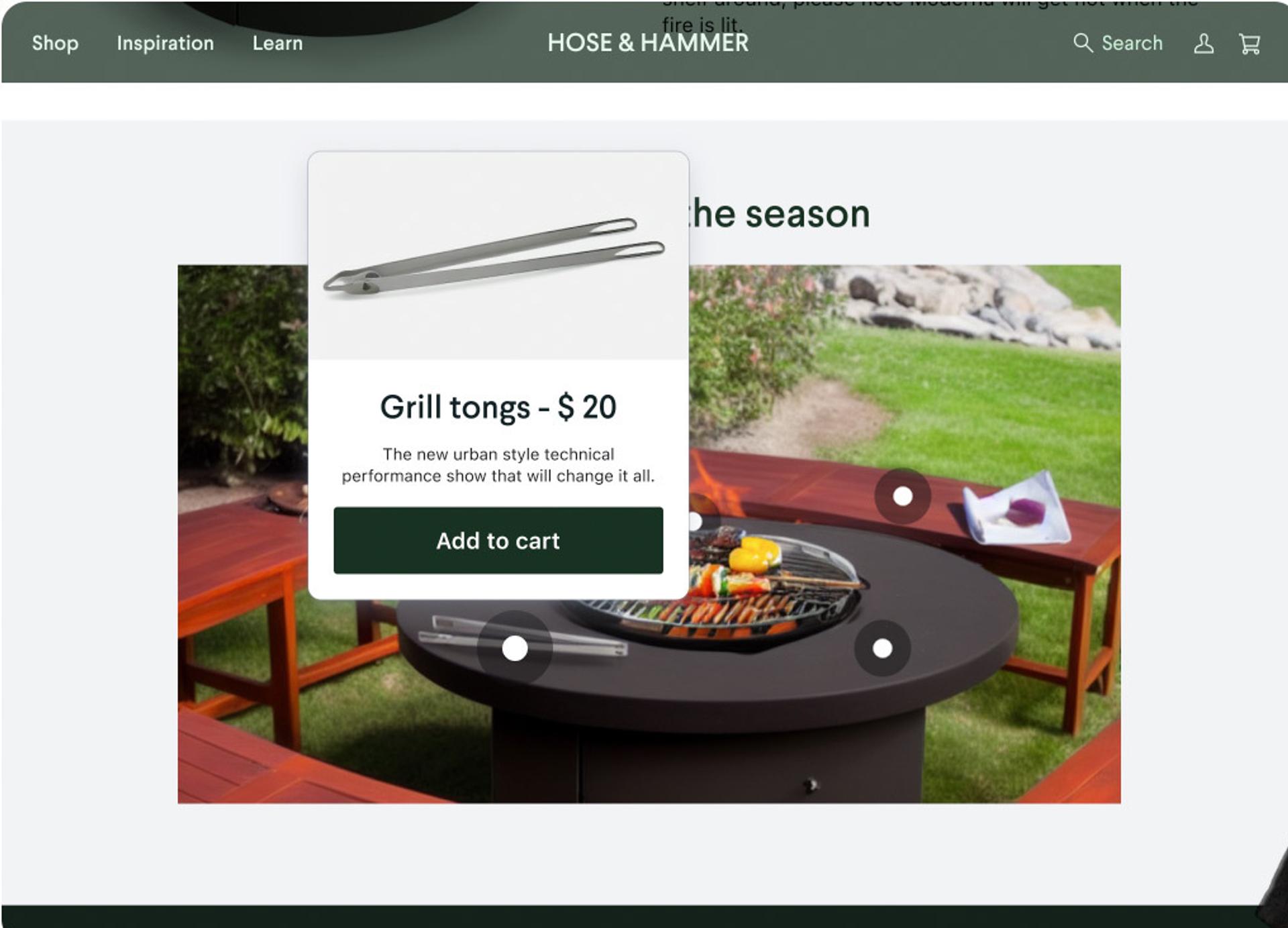
Think back to the online store selling the fire pit. While it makes sense to build separate product pages for a fire pit, a pair of tongs, a lid, and a griddle, teams can stretch their inventory and score additional sales by showing off these products in context.

With structured content, pages can automatically group products by category to highlight how they complement each other. Once the shopper sees the fire pit, tongs, lid, and griddle together, they might be inspired to get the whole experience.
People respond to good stories. Generic product pages aren’t just boring to look at. They lack a narrative.
Of course, it would take a lot of time and resources to generate new stories for every product on your site. Instead, apply a structured content approach to product data to easily scale narratives and experiences.
Imagine an e-commerce site that sells activewear: shoes, outerwear, trekking poles, kayaks. Based on features and categories, you can build a page with a story that ties these items together. Let’s say you want to craft a narrative about how someone could climb Everest with the right pair of hiking boots and camping gear. Your team could automatically link up the product pages for the boots and the tent to the page with the story. In addition to appealing the shopper’s sense of adventure, this allows people to discover similar or alternative products.
Leveraging structured content and its layout tools enables content teams to enrich the story behind a product. Equally important, it gives teams the ability to scale at their own pace without an army of designers.
If you're looking to level up your e-commerce product pages, you can watch my video where I cover this topic in depth below.
Start leveraging the power of structured content in your e-commerce to create brilliant product pages that convert.