Scaling to women across the world
Nour Hammour is a women-owned luxury fashion brand founded in 2010. They’re known for deeply understanding the needs of the women they serve—and using that insight to create exceptional products and experiences.
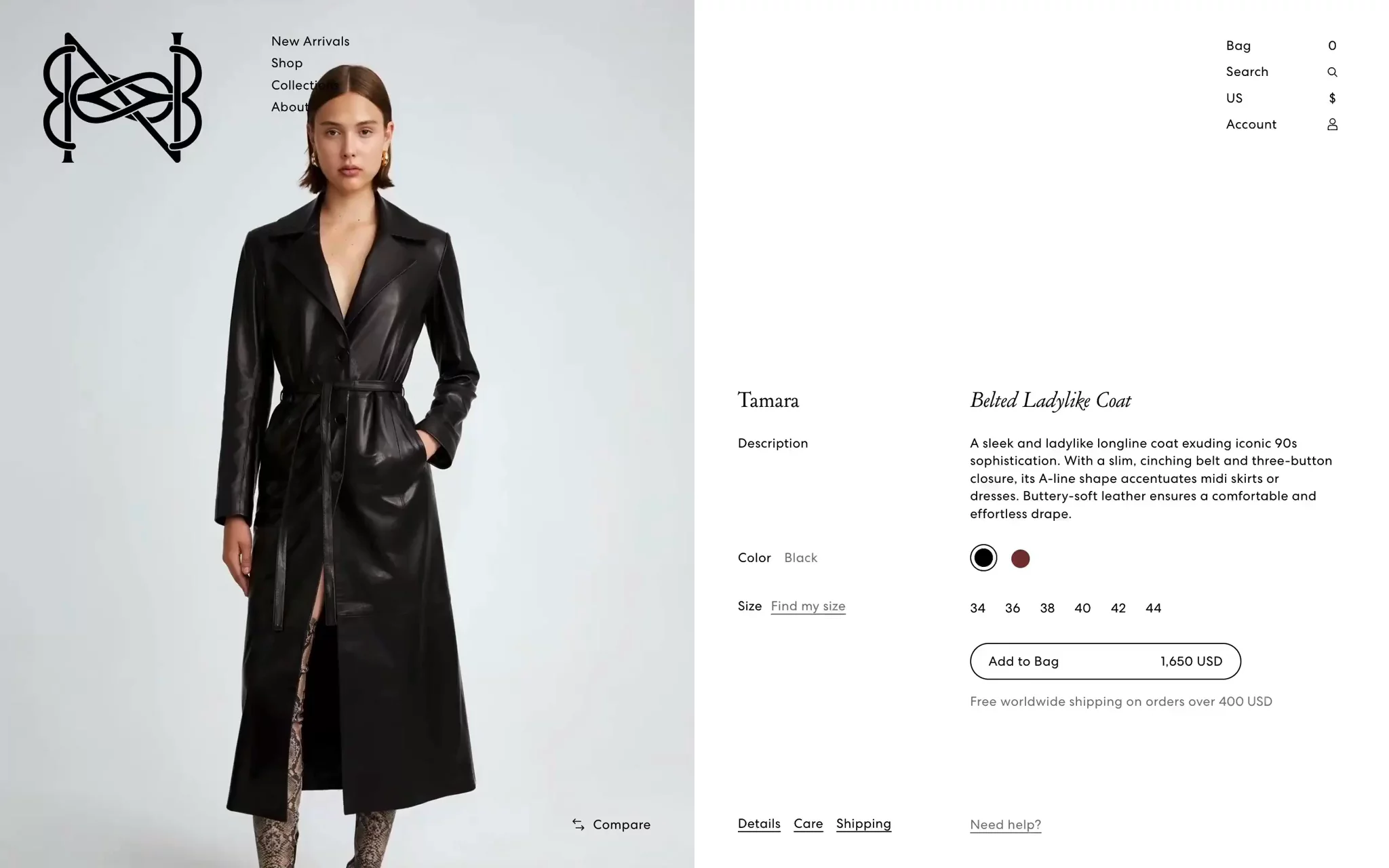
While Nour Hammour’s early sales were largely in-person at their boutiques and pop-up events, they’ve since scaled to full-blown collections available to women around the world. With more exposure coming to the brand via high-end retailers like FWRD and Net-A-Porter, Nour Hammour knew they needed to bolster their digital presence. Their goal was to ensure women just meeting the brand for the first time had the same elevated, luxurious experience online as they’ve always offered in-person.
Merchants tell me they have the vision, but they can't hire the armies of designers and content creators that they think they need. They don't, though. They need structured content and a little bit of everyday coding magic.
Bringing in-store luxury online
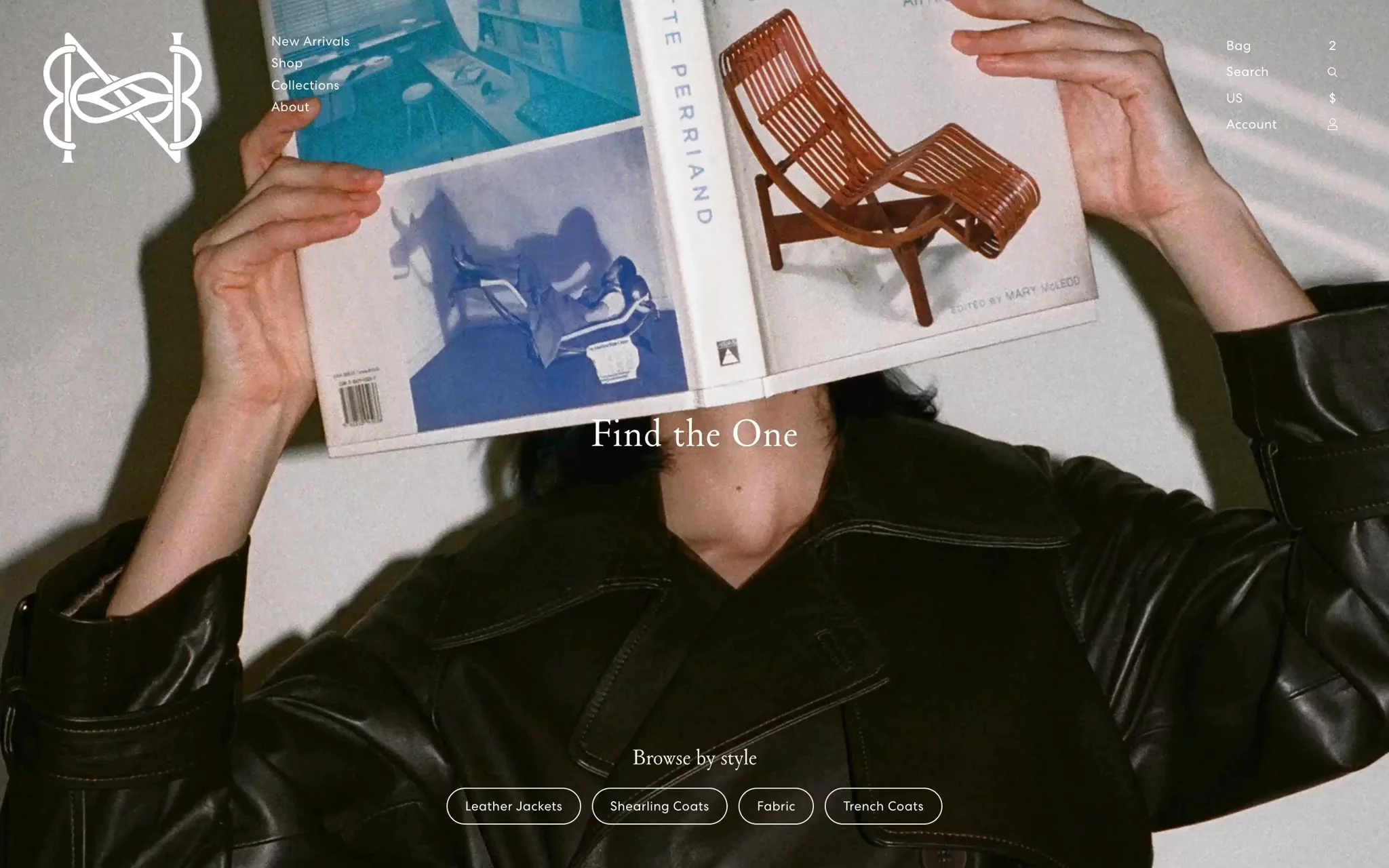
After years of serving clients in their natural habitat—upscale brick-and-mortar stores—Nour Hammour knows what women need to make a purchase decision. In meeting these needs online, the brand had to do so in a way that would both keep pace with their most tech-forward clients (leaders in Silicon Valley and entertainment) and be welcoming and intuitive for their traditional shoppers who have been foundational to their success.
They also needed to improve upon three major pain points:
- Sub-par site performance: Page load times were already degrading the client experience, which meant Nour Hammour couldn’t afford to add the richness of imagery and video that clients deserved.
- Constrained innovation: Many ideas for new shopping experiences were left on the cutting room floor due to out-of-the-box themes and rigidity of their existing monolith content management system, Wordpress.
- Friction-filled editorial workflows: The small team of designers, merchandisers, and marketers were losing hours to troubleshooting and repetitive tasks (like image cropping, re-cropping, and testing across every instance).
Nour Hammour was happy with the ease of use and familiarity of Shopify as their e-commerce platform, but they wanted to push the bounds of what they could do on the front end. Working with their agency partners, they chose headless commerce as the path forward.
Four months from design to fruition
Given the importance of brand look and feel for Nour Hammour, they began by engaging creative agency Ania et Lucie—a great fit given their understanding of the Franco American modern aesthetic. In turn, to bring their ambitious designs to life, Ania et Lucie recommended Commerce-UI as a trusted development partner.
Commerce-UI impressed Nour Hammour with the time they took to understand the brand’s industry, business, and timeline. They then advised on the best approach based on their learnings building immersive ecommerce experiences on their stack of choice: Shopify’s headless commerce toolkit, Hydrogen and Sanity Composable Content Cloud.
Read case study→“With Sanity, our developers were able to deliver on any ambition we had. The platform is so intuitive, we now actually enjoy our content work and have more time for innovation, comms, and PR.”
Given Hydrogen is purpose-built for Shopify, it mitigates challenges faced with other headless solutions—concerns like extra complexity, costs, and development overhead. For its part, Sanity has partnered with Shopify from the start of Hydrogen and Oxygen. Sanity extends the Shopify merchant experience by making it easy to express complex product relationships (like sub variants and the relationships between them) and provides a far more powerful (while still intuitive) editing experience.
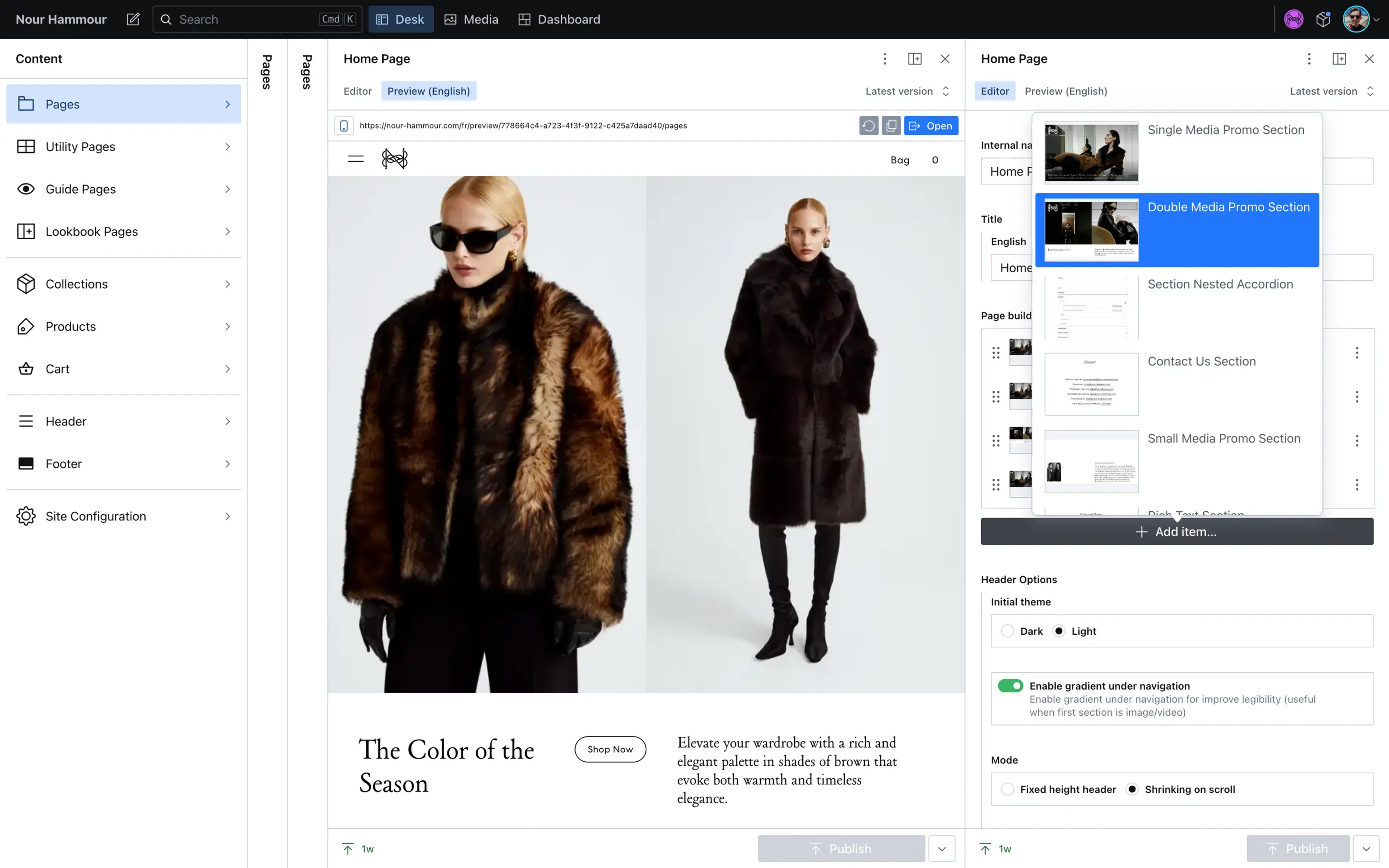
Composable commerce lets you use a best-of-breed CMS like Sanity. It gives marketers so many features to move fast, like real-time collaboration, visual previews, scheduling, and more. Plus the native Shopify Hydrogen integration gives them product lists directly within Sanity to seamlessly mix editorial with product data.
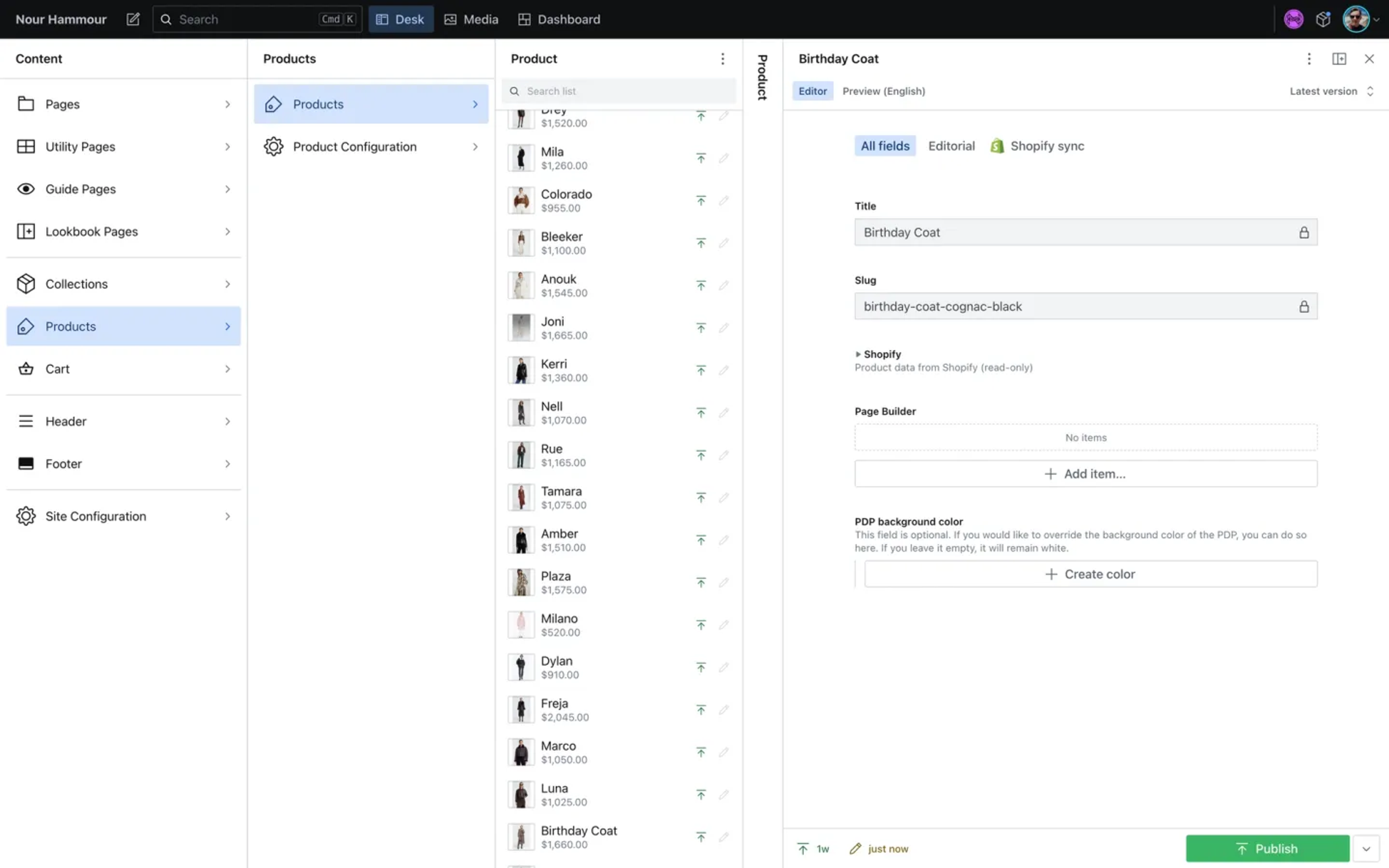
In less than four months from design handoff to launch Commerce-UI delivered on the vision for an immersive online experience. Key to success was incremental delivery and training for Nour Hammour along the way. The team prioritized global elements before moving to the most bespoke components, allowing time for design collaboration of these more complex capabilities.
Header and footer
Homepage
PDPs
Guides
Comparison tool
Throughout the development process, Nour Hammour was impressed with Commerce-UI’s ability to find solutions to any request, describing the project as “beautifully collaborative.”Leaning into the flexibility of Sanity Studio, Commerce-UI built in guidance and guardrails to make the editorial workflow intuitive. For the team (who had experienced friction during a prior CMS migration) this made the onboarding experience seamless.
Working in Sanity feels like having an intuitive, visual guide walk you through every step of the content workflow. The interface is incredibly user-friendly, visually pleasing, and optimized for simplicity. We're able to focus on content strategy rather than getting bogged down in convoluted platforms
High-converting customizations
Recreating the Showroom Experience Online
A pattern Nour Hammour observed across countless clients was the tendency to "build a rack" of options they were considering before making a purchase. They would select a few pieces that spoke to them and line them up side-by-side on a rack. They'd re-arrange, add and remove, repeatedly touching and feeling the fabrics and weight of outerwear to aid in their decision making.
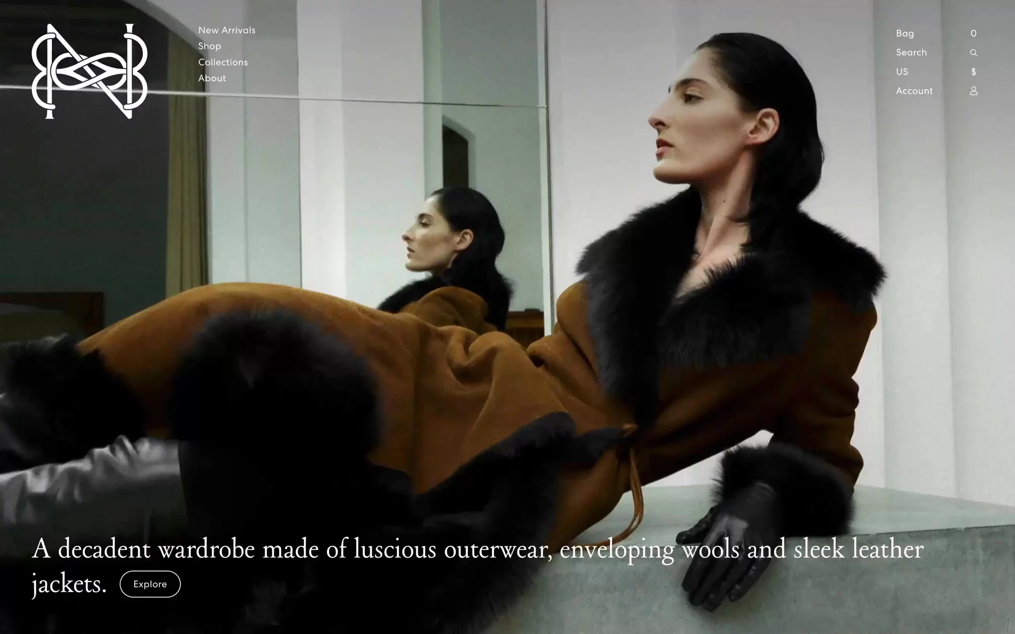
To build on this experience digitally, Nour Hammour created a custom "compare tool" on their new website that mimics this process online. Because product data is synced seamlessly into Sanity, the Nour Hammour team can enable clients to easily "build a virtual rack" and compare curated selections of outerwear right within Sanity—and without developer help.
Fresh, immersive content
Stunning visuals, streamlined image management
Nour Hammour outerwear is a carefully-considered investment. Online, Nour Hammour supports clients with high-resolution photography and plenty of video to convey movement of their pieces. Sanity’s back end, Content Lake, provides an out-of-the-box image pipeline and global CDN. A robust integration with MUX makes video workflows seamless.Critically, with Sanity, Nour Hammour has seen a 50% savings in time spent on image optimization. With Sanity, they’re able to upload a single high-resolution image for use everywhere, powered by metadata from Sanity’s built-in hot-spot and cropping tool. Image compression to improve page load times is offloaded to Sanity’s image pipeline entirely.
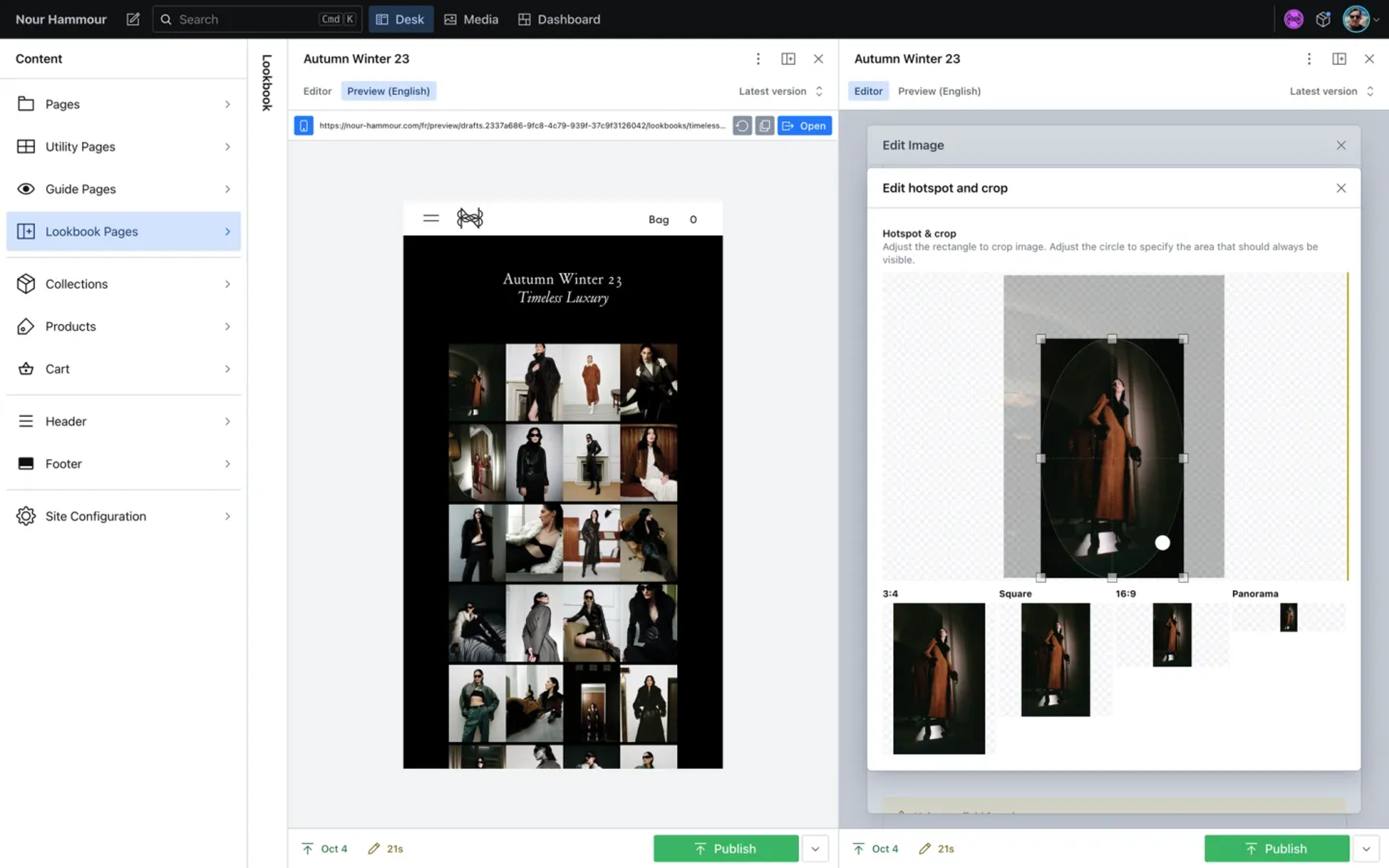
Sanity makes image handling—usually a headache—seamless. Merchants can effortlessly edit, crop, and enhance images, while developers can optimize rendering, which is crucial for site performance, with the image pipeline and robust API.
Ever-changing merchandising
With their prior solution, updating imagery and merchandising was time-consuming and tedious. It led to bottlenecks in execution which ultimately meant less experimentation and less frequent experience refreshes for clients. Now, with Sanity, Nour Hammour finds it “easy and fun” to create new mock-ups. Between monthly collection drops, Nour Hammour regularly changes up the content for their repeat visitors, driving greater engagement and conversion.
We're a very responsive company; if something’s off or we have a new idea, we’ll change it up. With Sanity we can have an ever-changing aesthetic without having to rely on a developer.
Editorial, not just e-commerce
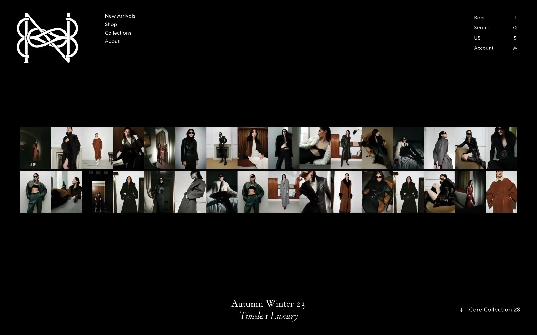
To uplevel the online experience, Nour Hammour curates lookbooks and guides with a strong editorial vibe—inspired by the fashion magazines their clients love to peruse. Nour Hammour has gone a step further, weaving commerce into these experiences (in a way that isn't possible with beloved print magazines, of course). As they enjoy content, they can add items to their carts without losing their “page.”
In just the first 3 months since launch, we’ve seen phenomenal results. Our Conversion rate is up 97% year over year, and sales are up 214%. We credit the way our site pairs a new level of immersiveness with performance and seamless commerce.
Discover Sanity for composable commerce
Learn how Sanity can speed your editorial workflows and help you stand out in a sea of lookalike e-commerce websites. Sanity allows you to build the composable commerce stack that’s best for your business—with flexible integrations to any e-commerce platform, PIM, ERP, and more. If you’d like a tailored demo, our sales team would love to talk to you.


