An opinionated guide to Sanity Studio

Official(made by Sanity team)
Sanity Studio is an incredibly flexible tool with near limitless customisation. Here's how I use it.

Simeon Griggs
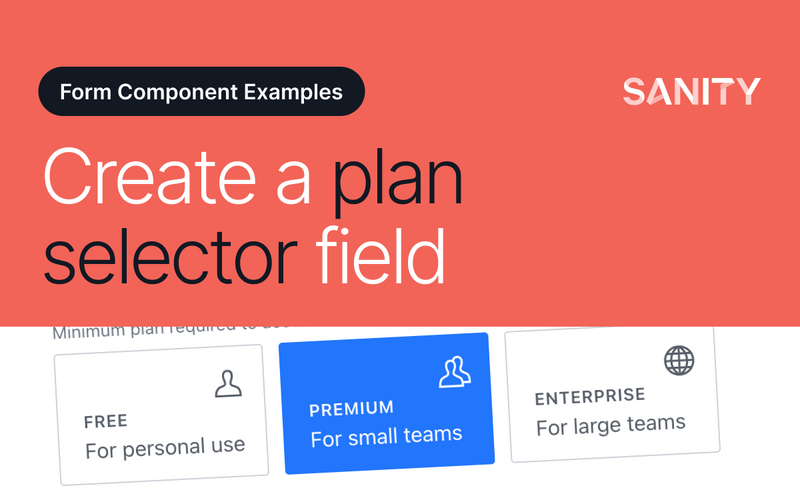
Go beyond a plain radio list of inputs by giving authors more contextually useful buttons to select values from.
This guide assumes that you know how to set up and configure a Sanity Studio and have basic knowledge about defining a schema with document and field types. Basic knowledge of React and TypeScript is also useful, although you should be able to copy-paste the example code to get a runnable result.
One of Sanity Studio’s most powerful features is custom drop-in replacements for form fields. This guide is one in a series of code examples.
You can get more familiar with the Form Components API in the documentation.
A string field with larger buttons to select a value packed with more relevant information.
In this guide, you’ll be creating a document type for a product feature. Each feature is only available on a certain plan and above. Plans are selected from a list of predefined strings.
Create the following schema type files and ensure they’re loaded into the schema property in sanity.config.ts
First, create a custom string type called plan. Creating a new schema type for this string type allows more flexible reuse throughout your Studio. For example, if multiple document types use this plan type with its custom input; but with unique options. By importing this schema type to the Studio schema, you can refer to this type with it’s value for name , in other words type: 'plan'.
// ./schema/plan/planType.ts

import {defineType} from 'sanity'

// We need will extend and import these in the custom input component later
export const PLANS = [
  {title: 'Free', value: 'free'},
  {title: 'Premium', value: 'premium'},
  {title: 'Enterprise', value: 'enterprise'},
]

export const planType = defineType({
  name: 'plan',
  title: 'Plan',
  type: 'string',
  options: {
    list: PLANS.map(({title, value}) => ({title, value})),
    layout: 'radio',
  },
})
Now, add a feature document type:
// ./schemas/featureType.ts
import {defineField, defineType} from 'sanity'
export const featureType = defineType({
name: 'feature',
title: 'Feature',
type: 'document',
fields: [
defineField({
name: 'title',
type: 'string',
}),
defineField({
name: 'plan',
type: 'plan',
description: 'Minimum plan required to access this feature',
}),
],
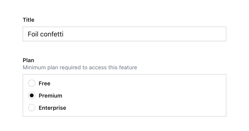
})Create a new feature type document, and you should see both string fields like below:
Let’s say you want to add more information to these plans with an icon and a description. The neat solution would to have a document type for plans and bring the selection from them, but for the sake of simplicity, you’ll be hard coding this information by extending the PLANS array with properties and values for icon and description. The out-of-box radio list doesn’t support these properties, but we are going to build an UI for them in the custom input component:
// ./schema/plan/planType.ts

import {defineType} from 'sanity'
import {PlanInput} from './PlanInput'
import {UserIcon, UsersIcon, EarthGlobeIcon} from '@sanity/icons'

export const PLANS = [
  {title: 'Free', value: 'free', description: 'For personal use', icon: UserIcon},
  {title: 'Premium', value: 'premium', description: 'For small teams', icon: UsersIcon},
  {title: 'Enterprise', value: 'enterprise', description: 'For large teams', icon: EarthGlobeIcon},
]

export const planType = defineType({
  name: 'plan',
  title: 'Plan',
  type: 'string',
  options: {
    list: PLANS.map(({title, value}) => ({title, value})),
    layout: 'radio',
  },
  components: {input: PlanInput},
})
Create a new input component using the code below:
// ./schema/plan/PlanInput.tsx

import {StringInputProps, set} from 'sanity'
import {Stack, Button, Grid, Label, Text} from '@sanity/ui'
import {createElement} from 'react'
import {PLANS} from './planType'

export function PlanInput(props: StringInputProps) {
  const {value, onChange} = props

  return (
    <Grid columns={PLANS.length} gap={3}>
      {PLANS.map((plan) => (
        <Button
          key={plan.value}
          value={plan.value}
          mode={value === plan.value ? `default` : `ghost`}
          tone={value === plan.value ? `primary` : `default`}
        >
          <Stack space={3} padding={2}>
            <Text size={4} align="right">
              {createElement(plan.icon)}
            </Text>
            <Label>{plan.title}</Label>
            <Text>{plan.description}</Text>
          </Stack>
        </Button>
      ))}
    </Grid>
  )
}
Now you’ll take whatever value is saved to the field and match it against a plan in the component’s PLANS array.
To see this component in the Studio, you’ll need to add it to the plan schema type:
// ./schemas/plan/planType.ts
import {PlanInput} from './PlanInput'
export const planType = defineType({
name: 'plan',
// ...all other settings
components: {input: PlanInput},
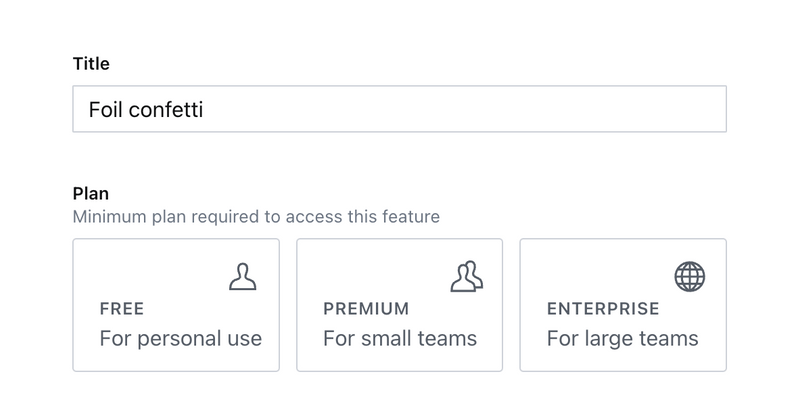
})Now when editing the document you’re shown a beautiful set of buttons with much more details and context for your authors.
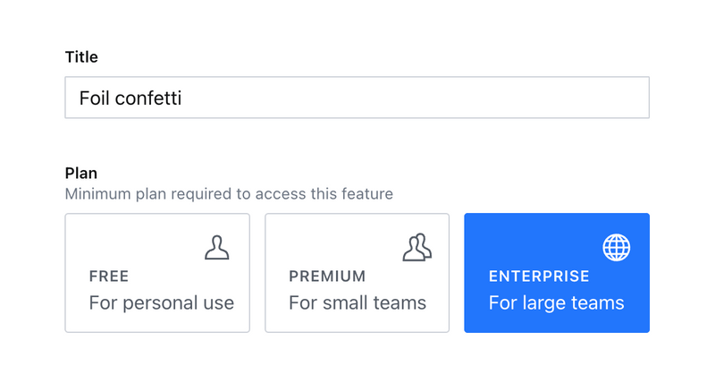
You can click these buttons but they won’t write anything to the document, yet!
Custom inputs contain helpful functions and details in their props – for this input, you’ll only need one: onChange.
This function wraps any patch – such as setting or unsetting the value of a field – and ensures the rest of the Studio stays up to date with changes.
When working with forms in React, you’re often recommended to store values in a component’s state. This is an anti-pattern working with Sanity Studio input components. Writing content to state is only reflected in the browser of the person using the input. By using Sanity’s real-time APIs you allow content creators to collaborate and avoid overwriting each other’s changes by always syncing directly to the Content Lake.
Update your PlanInput component to use the code below:
// ./schema/plan/PlanInput.tsx

import {StringInputProps, set} from 'sanity'
import {Stack, Button, Grid, Label, Text} from '@sanity/ui'
import {UserIcon, UsersIcon, EarthGlobeIcon} from '@sanity/icons'
import {useCallback, createElement} from 'react'
import {PLANS} from './planType'

export function PlanInput(props: StringInputProps) {
  const {value, onChange} = props

  const handleClick = useCallback(
    (event: React.MouseEvent<HTMLButtonElement>) => {
      const nextValue = event.currentTarget.value
      onChange(set(nextValue))
    },
    [onChange]
  )

  return (
    <Grid columns={PLANS.length} gap={3}>
      {PLANS.map((plan) => (
        <Button
          key={plan.id}
          value={plan.id}
          mode={value === plan.id ? `default` : `ghost`}
          tone={value === plan.id ? `primary` : `default`}
          onClick={handleClick}
        >
          <Stack space={3} padding={3}>
            <Text size={4} align="right">
              {createElement(plan.icon)}
            </Text>
            <Label>{plan.title}</Label>
            <Text>{plan.description}</Text>
          </Stack>
        </Button>
      ))}
    </Grid>
  )
}onChange is destructured from the component’s props.handleClick function with the set() function, to update the field’s value in the Content Lake. This means the new value will be instantly validated in the document and updated in the browser of any other authors currently viewing the same document.mode and tone of the button are updated to highlight which value is currently selected.Now you have a fully functional, automated, and editable coupon generator field with a handy visual preview!
Some ideas to extend this custom input include:
reference instead of a string.unset from sanity and add an extra Button to remove the value from the document.Sanity Composable Content Cloud is the headless CMS that gives you (and your team) a content backend to drive websites and applications with modern tooling. It offers a real-time editing environment for content creators that’s easy to configure but designed to be customized with JavaScript and React when needed. With the hosted document store, you query content freely and easily integrate with any framework or data source to distribute and enrich content.
Sanity scales from weekend projects to enterprise needs and is used by companies like Puma, AT&T, Burger King, Tata, and Figma.
Sanity Studio is an incredibly flexible tool with near limitless customisation. Here's how I use it.

It can be useful for testing plugins, front ends, or other integrations to have a Sanity Studio populated with fake content.

Setup interactive live preview with Presentation in a Next.js app router application

Summarise form progression by decorating the entire editing form for a document with a component loaded at the root level.