The Presentation tool
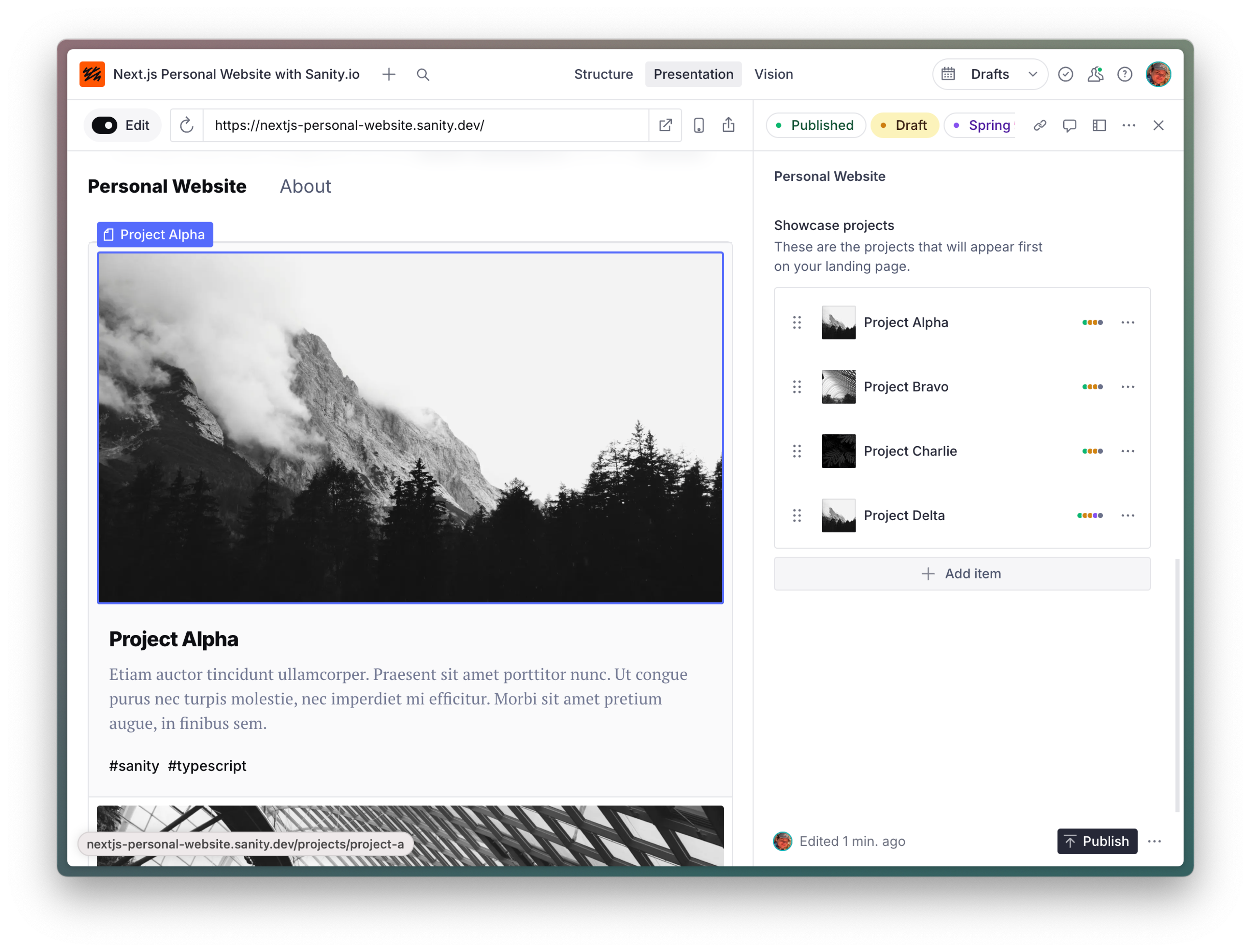
The Presentation tool enables Visual Editing for interactive live previews. This is how you set it up within your studio.
It provides:
- Live preview: See draft content updates in real-time within the Studio
- Click-to-edit: Interactive overlays that help content creators find and edit the right fields
- Page building: Advanced capabilities for adding, moving, and removing content sections
- Preview sharing: A way for content creators to share a preview with others
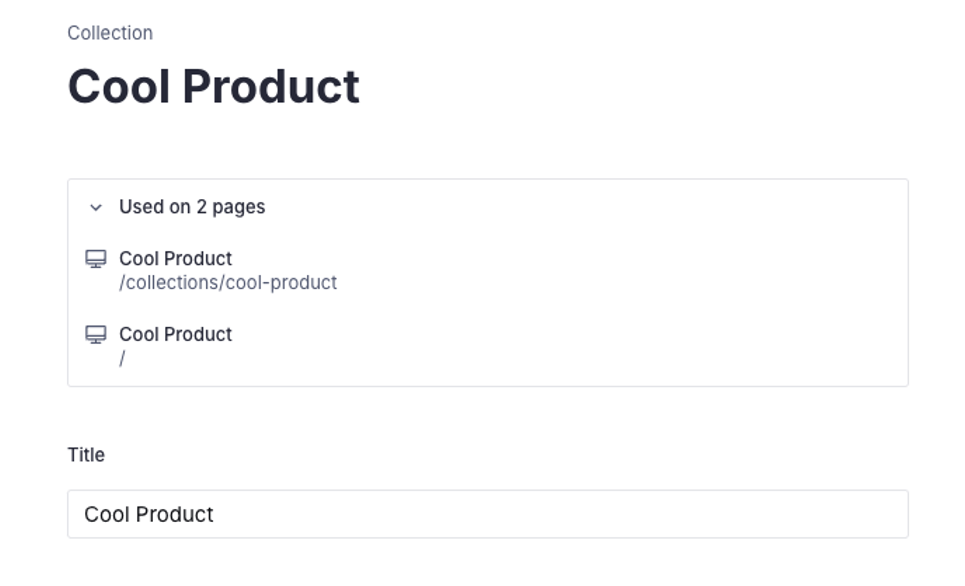
- Locations: Add shortcuts to open preview where a document is used from the Structure tool
For Studio-user friendly documentation, go to the user guide of the Presentation tool.

Prerequisites
To use the Presentation tool, your studio must be updated to v3.40.0 or preferably latest.
npm install sanity@latestpnpm add sanity@latestyarn add sanity@latestbun add sanity@latestProtip
You must also add Visual Editing support into your front-end application.
We recommend exploring the implementation guides (located in the left-side navigation), these will also take you through setting up the Presentation tool.
Configuration steps
Similarly to the other tools and plugins, you add the Presentation tool to your main studio configuration file. The example below shows a typical setup for a Next.js project where specific endpoints are supplied to let Sanity Studio put the front end into preview mode.
Basic configuration
- Import
presentationToolfromsanity/presentation - Add it to the
pluginsarray - Add your frontend-specific details, such as the
initialURL and endpoints for enabling or disabling preview mode
// sanity.config.ts
// ...all other imports
import { presentationTool } from 'sanity/presentation'

export default defineConfig({
  // ... all other config settings
  plugins: [
    // ...all other plugins
    presentationTool({
      previewUrl: {
        initial: 'https://my-cool-site.com',
        previewMode: {
          enable: '/api/draft-mode/enable',
          disable: '/api/draft-mode/disable',
        },
      },
      allowOrigins: ['http://localhost:*'],
    }),
  ],
})
Protip
If you are working with an embedded studio you can skip theinitialproperty on line 11, and theallowOriginsproperty on line 17, of the example.
Map content to front-end routes
To map Sanity documents to their corresponding front-end routes, create a resolve.locations configuration. This object tells the Presentation Tool how each document type corresponds to a route in the front end.

Protip
You can also provide resolve.mainDocuments to customize what documents open by default when Presentation Tool navigates to a preview URL.
Add route definitions for your document types
In the example below, we map documents of type product to /products/${slug} and add them to the top-level index. You will need to substitute your own types and routes as appropriate.
// ./lib/presentation/resolve.ts
import {defineDocuments, defineLocations} from 'sanity/presentation'

// Configures the "Used on x pages" banner
export const locations = {
  // Map document types to frontend routes
  product: defineLocations({
    select: {title: 'title', slug: 'slug.current'},
    resolve: (doc) => ({
      locations: [
        {title: doc.title, href: `/products/${doc.slug}`},
        {title: 'Products Index', href: `/products`},
      ],
    }),
  }),
  // ...
}

// Configures documents presentation tool should open by default when navigating to an URL
export const mainDocuments = defineDocuments([
  {
    route: '/products/:slug',
    filter: `_type == "product" && slug.current == $slug`,
  },
  // ...
])
Import the resolver function into sanity.config.ts and pass it to the presentationTool config
import {defineConfig} from 'sanity'
import {presentationTool} from 'sanity/presentation'
import {locations, mainDocuments} from './lib/presentation/resolve'

export default defineConfig({
  // ...
  plugins: [
    presentationTool({
      resolve: {locations, mainDocuments},
      previewUrl: {
        initial: 'https://my-cool-site.com',
        previewMode: {
          enable: '/api/draft-mode/enable',
          disable: '/api/draft-mode/disable',
        },
      },
      allowOrigins: ['http://localhost:*'],
    }),
  ],
})
Multi-origin configuration
Sometimes you need multiple allowed origins, like in scenarios where a single studio handles the content many sites or properties. allowOrigins accepts an array of origins that Presentation will recognize.
import {defineConfig} from 'sanity'
import {presentationTool} from 'sanity/presentation'

export default defineConfig({
  plugins: [
    presentationTool({
      allowOrigins: ['https://example.com', 'https//example.store', 'http://localhost:*'],
      previewUrl: {
         initial: 'https://example.com/' // the initial preview URL when there's no `&preview` param in the URL
      }
    }),
  ]
})
You can also provide an async function to configure it dynamically.
import {defineConfig} from 'sanity'
import {presentationTool} from 'sanity/presentation'

export default defineConfig({
  plugins: [
    presentationTool({
      allowOrigins: async ({client, origin}) => {
        // Query known origins from the current dataset with the sanity client.
        const productionDomains = await client.fetch<string[]>(`*[_type == 'market' && _id == $id].domains`, {id: 'europe'})
        // If the studio is running from localhost we also allow Presentation to connect to any localhost instance
        if(origin.startsWith('http://localhost/')) return [...productionDomains, 'http://localhost:*']
        return productionDomains
      },
      previewUrl: {
        // Resolving the initial URL when no search param of the preview URL is present also takes an async function
        initial: async ({client, origin}) => {
          // If the studio is on localhost we assume the Next.js instance is also running
          if(origin.startsWith('http://localhost/')) return 'http://localhost:3000/'
          // Otherwise we pick the first production domain as the initial URL
          return client.fetch<string>(`*[_type ==  'market' && _id == $id].domains[0]`, {id: 'europe'])
        }
      }
    }),
  ]
})
Configuration reference
The Presentation tool takes the following configuration attributes:
RequiredpreviewUrlstring | PreviewUrlOption
Accepts an object with keys for setting the
initialURL of your front end, as well as defining endpoints for enabling or disabling preview mode in your front end. Also accepts a plain string in the shape of a URL for projects that don't need the detailed setup.iconReact component
Sets an icon to represent the Presentation tool in the Studio's navigation bar. To use Sanity icons, install the @sanity/icons package.
namestring
Sets a name for the Presentation tool. It's not visually represented in the Studio UI, but it’s included in the Studio's URL for the Presentation tool.
This is useful if you want to implement multiple instances of Presentation, for example, for different channels, domains, or preview environments.
Default value:
presentationtitlestring
Sets the title that is displayed in the Studio's navigation bar. Keep it short and descriptive to help editorial users understand what they can do with the tool.
Default value:
Presentationresolve{ mainDocuments?: DocumentResolver[]; locations?: DocumentLocationResolvers | DocumentLocationResolver }
Return the document-to-URL mapping to add affordances to quickly open documents in the Presentation tool. Go to the Presentation Resolver API documentation to learn more.
allowOriginsstring[] | (context) => Promise<string[]>
A list of URLPattern strings that defines what URL origins can be opened in the preview iframe. The URL origin returned in
previewUrl.initialis always allowed. Other URLs that may be manually entered in the URL bar, defined inresolve.locationsand such will have to be in the allow list or Presentation Tool will refuse to connect. URL origins you specify will be able to send postMessage events to your Sanity Studio and can run live preview queries, don't add an URL origin you don't trust.
Was this page helpful?